Bucketlist by Lonely Planet
Lonely Planet’s goal setting companion app.
Providing a simple and intuitive way to make dream trips with friends a reality

To jump to a specific section of the case study choose one of the items below, otherwise keep on reading!
High-Fidelity Prototype (coming soon)
Final Product (coming soon)
Reflection (coming soon)
Project Details


The Brief
Ever since 1972 Lonely Planet has put travelers at the heart of everything they do, informing and inspiring them with trusted print and digital content for every destination. Despite the strength of their brand with young travelers, Lonely Planet’s business has shrunk significantly due to the COVID-19 pandemic.
The Problem
Lonely Planet needs a digital product that enables young users -- who are isolated, bored and overworked during the pandemic -- to live their best lives and inspire them to plan travel in the future.
The Solution
We aimed to design a goal setting companion app that not only inspires users to travel in the future through exploration content, but also mitigates the common obstacle of not having “enough time or money”, allowing them to track how much money and vacation time they need to save in order to make a solo or group trip and/or experience a reality.
Design Process

Research
Because Lonely Planet is so well-known as a guidebook company the first thing to do was to identify their current app offerings. This came in the format of a product audit surrounding the features on their current website, as well as their Guides app and Trips app.

How is the competition doing it?
In the travel world the number of competitors continues to grow, but what about Lonely Planet’s main competitors including, TripAdvisor, Mapify and TripIt? A Competitive and Comparative Analysis was completed against these competitor brands, as well as comparative brands Mint and Splitwise, to gauge various industry solutions. These were our 6 main takeaways:
5 out of 7 of the reviewed app resources (travel and budget) included onboarding and sign up screens as a way to introduce users to the platform
All of the travel resources below, as well as the budget apps, include bottom navigation
5 out of 7 resources (travel and budget) integrated a search bar feature
4 out of 5 travel resources had the ability for users to save and view their favorite trips/activities
Mapify has the most robust feature offerings of all the travel resources — including quiz screens, journaling ability and a integrated social media feed
Splitwise is the most robust resource when it comes to budget planning — offering the ability to add friends, create groups, divide expenses, transfer money in app and an activity feed to stay up to date

With the current offerings and competition narrowed down it was time to gain critical insight on the user’s current experience, likes and pain points with Lonely Planet and its competitors, as well as their needs and wants. Following the C&C, an initial Google survey was sent out across various UX channels on Slack, UX groups on Linkedin and across social media.
Our initial survey allowed us to empathize with what Lonely Planet’s users are currently experiencing when they search for travel ideas and/or try to plan trips. We were able to identify their likes and goals with the inspiration process, along with their frustrations and pain points when it comes to planning trips and the ability to follow through. This first round survey resulted in 19 responses.
That survey said...


We then identified 8 users from the survey responses who were willing to chat more about their experiences, giving us more insight into the emotions they experience while travel planning and the frustrations and obstacles they face that are holding them back from taking the leap to make their dream trips a reality.
Users do not travel because they feel like they don’t have the time or money
Half of users prefer to have a trip planned, while the other half like to go with the flow
Users who like to go on planned trips plan them around specific excursions and from their wishlists
And users typically go to social media to find travel inspiration/ideas, because it’s user-friendly and accessible
Synthesize
Following our initial research we began to synthesize all of the data into an affinity map to pull out key findings and trends and identify our primary and secondary user.

Defining the likes and pain points many users are experiencing with Lonely Planet’s current offerings, as well as their needs and wants largely stemming from what they are experiencing with competitors products and what they feel is missing in the industry. we put ourselves in the shoes of Lonely Planet’s two main personas (which have been slightly adjusted in the iteration phase) to address the two biggest trending problem statements.
Let's meet them, shall we?
The primary persona: Markus Janssen
Markus is a social media manager at a well-known agency, working on a variety of consumer brands. In his spare time he freelances as a photographer, and dreams of one day having the ability to become a digital nomad. Because of his love of creating and being outdoors, he regularly goes on impromptu weekend trips around his home state. But Markus feels as though he doesn’t have “enough time and money” he rarely goes on his bucket list trips out of the country – and so that list keeps getting longer and longer.

Markus needs...
a way to find and plan affordable trips to his dream destinations, so that he can check places off of his bucket list and get that much closer to his dream of becoming a digital nomad.
The secondary persona: Kelsey Waldorf
Kelsey is an art director for a well-known children’s brand. In both her personal and professional life Kelsey is very artistic and loves expressing herself through sketching, painting, film photography and more – and sharing all of her creations on social media. She worked hard to get to the position of art director at one of her favorite brands, and because she celebrates major life milestones with a trip wants to be able to plan her next getaway with her closest friends to a city full of art and culture.

Kelsey needs...
a platform that will allow her to search for, share and plan fun trips with her group of friends, so that she can alleviate the pain and stress that comes from trying to plan group trips.
In the first round of research we bypassed the opportunity to write “How Might We…” Statements in order to further empathize with Markus and Kelsey. I believe this lead to our design failing in our first round of usability testing. In order to rectify this, prior to beginning the iteration phase of the design I went back and identified key problems we could solve for Markus and Kelsey, helping define the direction of the new wireframes.
I thought to myself:

Design & Ideate
Markus and Kelsey share the same frustration that time and money are holding them back from living their best travel lives currently, but they want to have distinctly different experiences.
Markus wants to figure out how to go on more global adventures so that he can get that much closer to becoming a digital nomad, and Kelsey wants to be able to share group trips with her friends so they can plan a budget that can be split evenly. They both need help figuring out how to set and achieve budget and vacation allotment goals.
This insight, gleaned from our survey results and user interviews — that users felt that they need more time, money and accessible inspiration for travel planning — were the backbone to the three pathways we chose for our home screen design: a flow to enter the staycation portion of the app to view and plan trips/activities close to home, a vacation flow to view and plan trips that require travel (via plan, train, car, boat, etc.), and a bucketlist flow (to help users budget their time and money for their saved trips and activities. Each of these pathways informing our subsequent user flows for Markus and Kelsey.
But…
These flows were part of the reason our design was not successful in our first round of usability testing.
During the iteration phase where I redesigned the wireframes of Bucketlist after defining the “How Might We…” Statements I rethought the user flow in order to design the most optimal path Markus and Kelsey would take to solve their problem statements.
The users' optimal flow

Ideating through Design Studio
We ran a 1-hour design studio – broken up by each team member working on one of the potential user flows from the home screen – which opened up a flood of brainstorming possibilities and resulted in 8 possible solutions. The first round of sketching allowed us to get all of our ideas out on paper. The second round allowed us to refine those ideas and sketches, narrowing down our sketched solutions and creating a more cohesive style. After this second round of iteration, we determined creating a tool to help users budget and meet their time and money personal goals would be an interesting solution.
Possible solutions:
Add a veteran’s page to the current website
Rework the current website to fit the “explore, train, career” path we identified, but add in a special veterans page
Build a fully separate veteran’s website, and leave the current website alone
Rework the current website, and sprinkle in veteran-relevant information throughout
Round 1 Sketches

Round 2 Sketches

The only way we would know if our sketches were headed in the right direction was to test them.
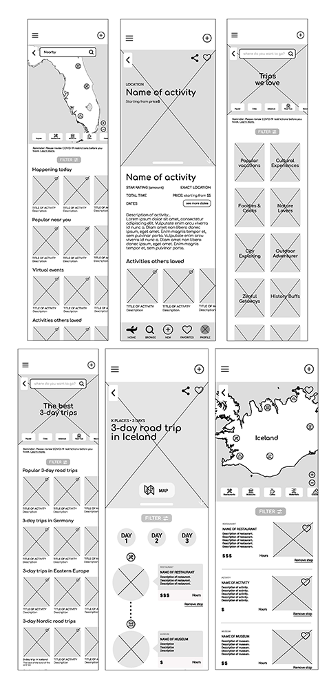
In order to test we needed a working prototype, so we took the sketches produced by the group in our Design Studio and built a series of mid-fidelity wireframes (created and prototyped using Figma) for each of the three user flows (staycation, vacation and bucketlist) we identified as paths for Markus and Kelsey. A sample of the wireframes – built in black and white with image placeholders – are shown below.
Staycation User Flow

Vacation User Flow

Bucketlist User Flow

Test
Once our sketches were recreated as working mid-fidelity wireframes it was time to test on our users. But then…
DUN DUN DUUUUN!
Our design failed.
3 out of 6 users were unable to successfully complete the vacation user flow.
100% of users stated they did not understand the purpose of the app -- the ability to plan trips and create goals -- based on the home screen design alone.
3 out of 6 users stated they liked the “quiz screens” but wanted to see them in an onboarding flow rather than a part of the main flow to enter the vacation and staycation user flows.
4 out of 6 users stated there were too many clicks to get to the final results to see a listing of suggested staycation activities or vacation itineraries.
It was time to take a step back, re-read the brief and reiterate the solution.
Reiterate
At the end of the day Lonely Planet wants to create a digital product that enables isolated, bored and overworked users to live their best lives and inspire them to plan future travel. And our two key personas want to overcome the setback of “not having enough time or money” to be able to do all of these things.
So how did I solve those business and user problems?
First, I took into consideration the user feedback that was received in the first round of usability tests:
Users want to see a view of their progress first when entering the app
Users don’t like the iconography of the piggyback and hourglass
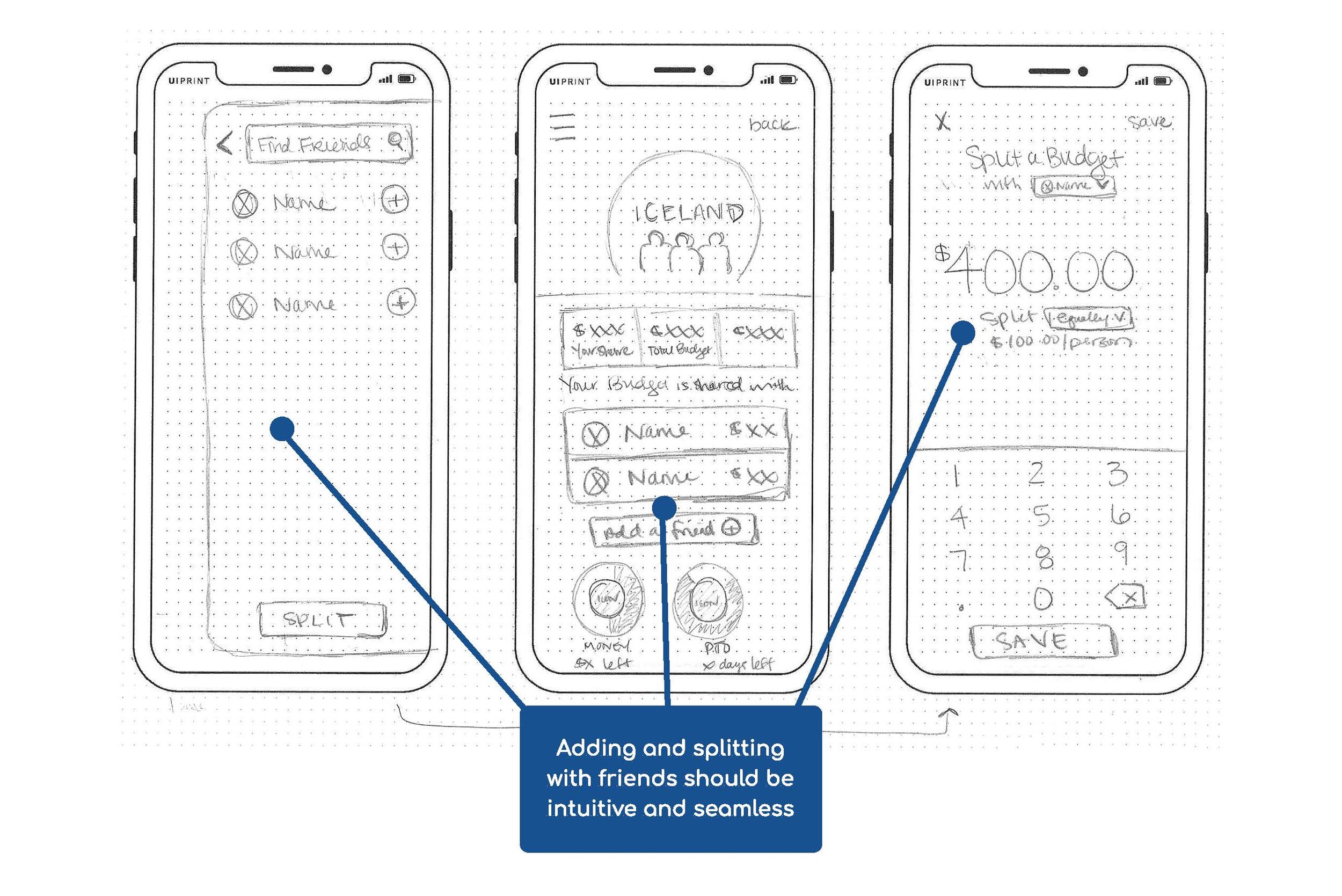
Users want to be able to customize their goals and the way they view these goals
Users want to be able to share their plans and goals with friends
Users don’t want to see a generic search engine, they want to see results that are curated to their personal needs and goals
Then, it was then time to arm myself with pencil and paper to update the product design for Markus and Kelsey via another round of sketching. While addressing the user needs above, the second iteration resulted in a new home screen design featuring a user profile overview of saved trips/activities, goals set and progress indicators, the integration of the “quiz screens” within a trips overview screen and a more streamlined way to search for, select and save “staycation activities” and larger trips.


Voila! We have a new and improved design to test!

Prototype and Re-Test
Usability testing currently in progress
Currently a second round of usability testing is being conducted to see the viability of these user influenced modifications. By integrating these user additions the goals of these tests being conducted include:
Determine which feature best optimizes connectivity for users
Learn what content is the most important for users on a progress page home screen
And, determine the best point within the user flow (when searching for travel/activity inspiration) for users to “add friends” to their wishlist and plans
Learn how users prefer to track their goals when it comes to monetary saving and saving vacation days (if employed)