
Powell’s City of Books eCommerce Redesign
Bridging the gap between the famous Portland in-store experience and online shopping for Powell’s Books.
Project Details


To jump to a specific section of the case study choose one of the items below, otherwise keep on reading!
Background
Since 1971 Powell’s Books has been synonymous with Portland, Oregon (the “City of Roses”). It’s impressive used books collection and color coded rooms spread across a city block have attracted millions of visitors from all over the world. Through Powells.com they also reach readers around the world, but in 2020 a little thing called COVID-19 put immense pressure on the eCommerce side of the store — which has always been known more as an “in-person experience” — almost forcing the store to shut its doors after more than four decades.


This is where I came in. To, as a native Portlander (now East Coaster) help a beloved icon from my childhood reinvigorate their online presence and solve the age-old problem that has plagued online shoppers for years:
How to merge the reliability and convenience of shopping online with the unique atmosphere and welcome escape you feel in-store while browsing and “holding” a book before purchasing.
The Brief
Create a redesigned online experience that empowers users to explore tailored recommendations, “look inside” of a variety of books prior to purchasing and save products to their favorites — bringing Powell’s unique in-store feel and neighborhoods vibes to the digital space.
The Process

Empathize
Research the competitors.
To better understand how Powell’s Books can not only meet the competition, but stand out in the realm of previewing books, I did a C&C and Plus/Delta Analysis on two local competitors, as well as against Target and Costco, which mapped current product discovery and checkout experiences against the same flows on Powell’s website. Finally, I compared the features of these same online retailers to Powell’s current site.

Understand the user’s needs, wants, likes and pain points.
To gain critical insight on the user’s current experience of shopping online for a book vs the experience they have when they are in-store, I sent out a screener survey via Google and subsequently conducted 4 user interviews and an open card sort. All of this research was then synthesized into an affinity and empathy map.


Define
By defining the key needs, wants and pain points most users experience with the current online book buying experience I put myself in the shoes of Powell’s two main personas to address the two biggest trending problem statements, leading me to the realization:

Let's meet Becky and Sam, shall we?


Keeping in mind the needs of the business and the user it was time to reorganize Powell’s online inventory. To do this I conducted an open card sort with 5 users resulting in 5 overarching content categories that would enhance the user’s online shopping experience and compliment the current in-store layout and organization people know and love. Enter Powell’s new and improved Information Architecture which provided a more intuitive way to redesign the online shop and reorganize the wide breadth of available product.


Ideate
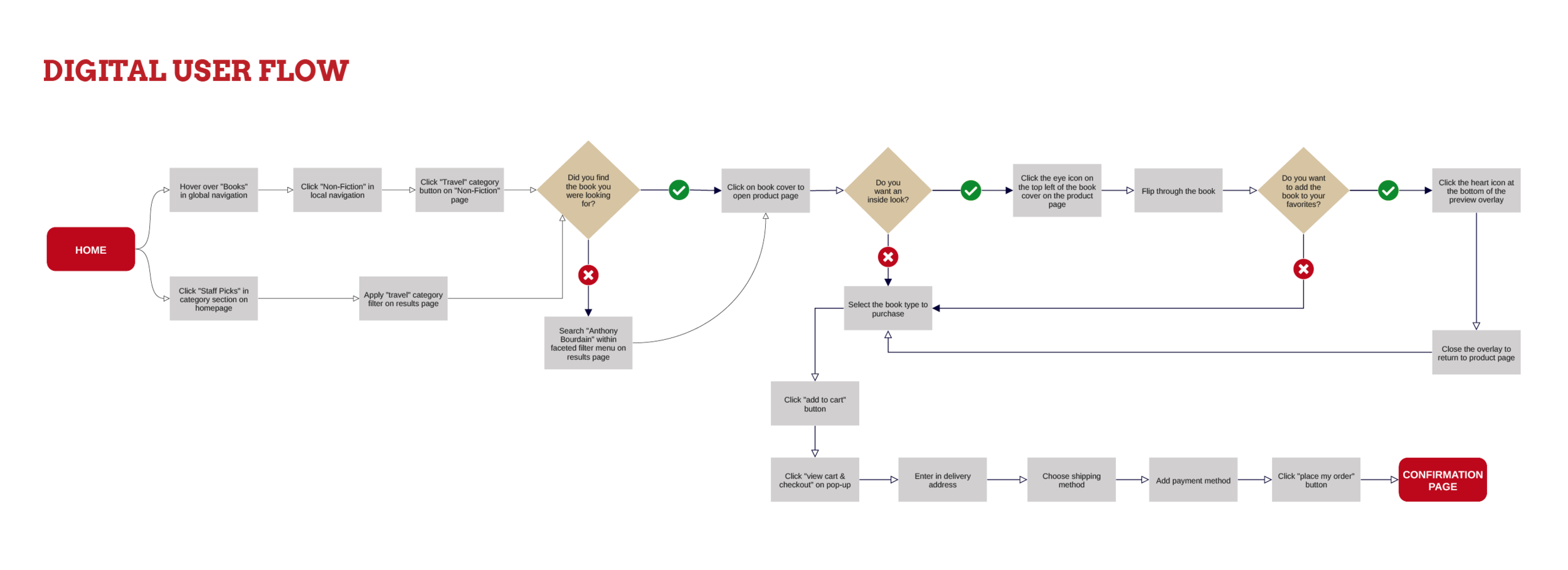
Armed with a pencil and sketchbook I quickly sketched multiple product discovery and checkout user flows to empower my personas to find the products they were looking for and complete the checkout process all within 10 minutes or less. These flows were the backbone to my multiple rounds of hand sketched (and tested) wireframes which simplified Powell’s current design elements into an easy to navigate, intuitive and visually appealing experience.


Prototype and Test
To put all of the research and initial designs to the test the mid-fidelity wireframes (see above) had interactions applied in Figma and went through 2 rounds of usability testing. The first round was completed with 5 users and revealed that:

The above key findings from the usability tests influenced 2 additional sets of design iterations which resulted in a more advanced UI for the global navigation, a new homepage design featuring a highly requested search bar and streamlined content sections, a simplified product information page and the integration of a “Look Inside” overlay allowing users to flip through a book and apply the option to hear the crinkle of the book’s pages as they flipped through.


Final Product
The integration of these user influenced modifications and additions resulted in a 100% completion and success rate surrounding the 2 new user tasks in the final usability test on the high-fidelity prototype.

Reflection
What I learned.
Too much information is counterproductive. Taking a deep dive into advanced UI can really streamline your Information Architecture, make the usability of a site even better and improve the user’s experience overall
The information that can be gained from (open and closed) card sorts is extremely insightful to see how user’s view and understand product categories and can greatly influence the most optimal path a user takes to a product
Items on my “next steps” to do list.
Continue to evolve the checkout process so users can purchase more than one item for more than one person at a time (e.g. purchase a gift card for a friend and a book for themselves in one transaction)
Integrate a music feature to bring more of the “in-store” experience online (e.g. build out a pop up for users to choose and apply “mood music” to their shopping experience)