Stockholm Live Metro Map
A responsive experience empowering travelers to explore the city of Stockholm, Sweden via a customizable, responsive and user-friendly live metro map.
To jump to a specific section of the case study choose select a specific section:
OVERVIEW

UX and visual design tools utilized throughout the project included, Figma for all design files, Miro for journey mapping, Maze.co for user testing, Zoom for user testing & interviews, Survey Monkey for research surveys, Adobe Illustrator for components & UI elements, Adobe InDesign for some case study artifacts.
The Solution
A customizable and user-friendly live metro map website, catering to travel influencers and their audience, based on the needs of the client (e.g. The Swedish Transport Administration), providing:
A responsive experience
Empowering on-the-go users to research, save locations and route plan outside of Google MapsMore accessibility
So visitors (and locals) who do not speak Swedish can maximize the public transit systemTransparency
Into fares, service updates, and multiple transit reducing user frustration as they explore the city of Stockholm
Project Details
Clients: The Swedish Transport Administration
Audience: Travel Influencers and their audience
Sectors: Transportation, mobility, information technology & services
My Role (solo passion project): UX Researcher, UX/UI Designer & Interaction Designer
The Problem

To get a closer look at the research, design process and usability testing results, continue reading below.

SL Stockholm’s current offering:
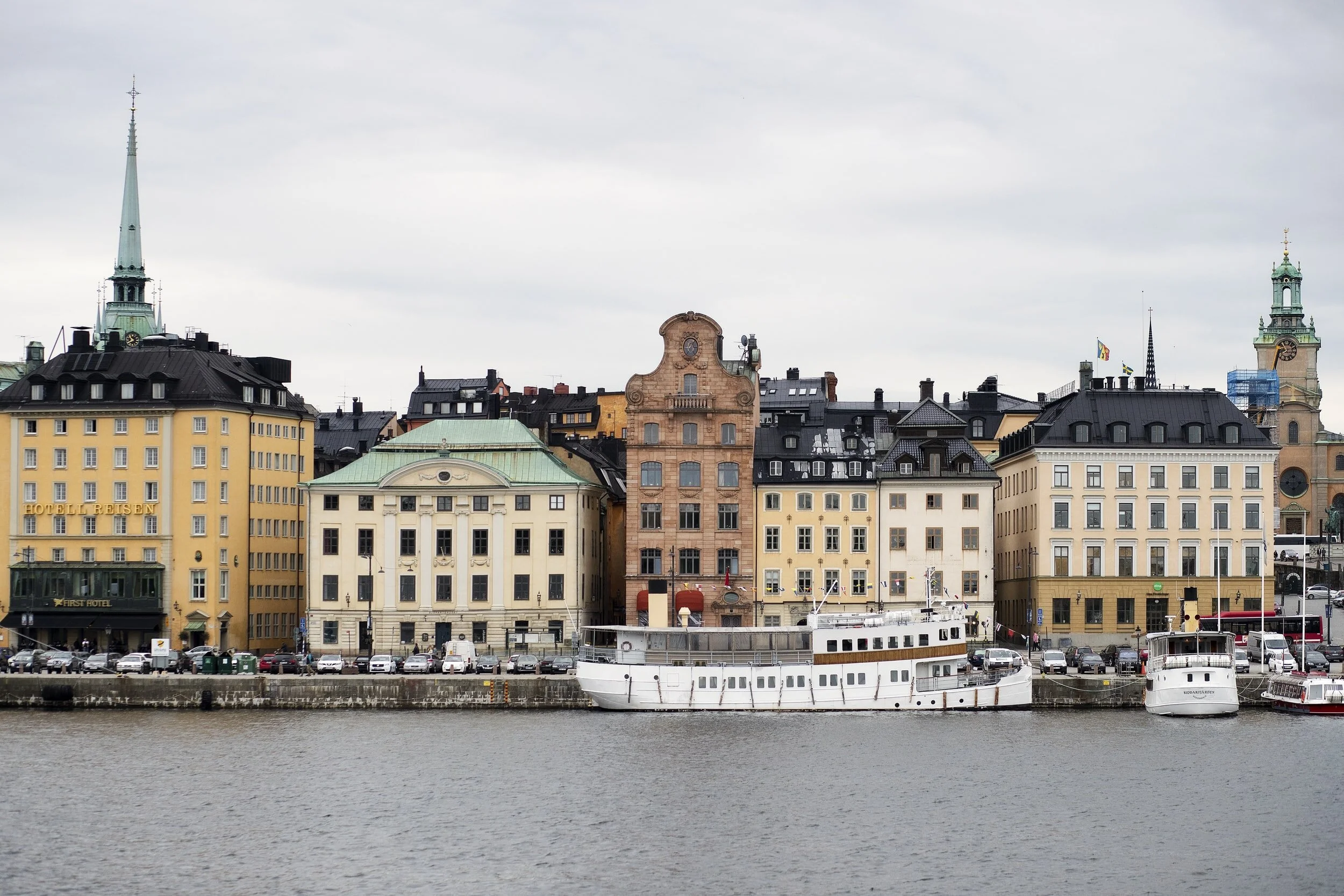
The current website experience for the SL Stockholm transit system (including the Tunnelbana, bus routes and tram routes) has an air of Xenophobia to it – through the lack of language and currency options, and no onboarding experience. If you’ve never traveled to the city of Stockholm, or are not a local, adaptation and adoption will take longer for most users.

THE RESEARCH
Competitive & Comparative Analysis

Where SL Stockholm falls short...
Lack of language options
Peak & non-peak times are not indicated
Users cannot see real time status updates
Stations within the system do not indicate relevant train lines
Missing landmark information by station
Features such as category toggle overlays are not included
Surveys & Interviews
Resulting in…
80% of users prefer to drive or use a ride share service to get around vs utilizing public transit
If open to using public transit, 60% of users have more confidence to use public transportation in Europe, over North America and Asia
100% of users will always default to Google Maps…
but a majority of users would use a local resource if it allowed them to:
route plan
see fares
incorporate other transit modes, etc
To gain insight into the pluses, minuses and pain points users currently experience through every stage of planning a trip on a public transit system (whether they are familiar with the system or not), as well as what their ideal public transit map/trip planning experience looks like, two SurveyMonkey surveys were conducted (with 21 responses), in addition to 13 user interviews (via Zoom).

The Persona
Insights gained from surveys and user interviews informed the development of one main persona, tech savvy travel influencer Sarah Jansen.

“How might we”…
After identifying Sarah’s current public transit pain points, needs, wants and goals…

Survey and interview responses, key trends stemming from an affinity map, and ‘how might we’ statements resulted in the building of 2 user flows to define Sarah’s research and route planning process – two fundamental tasks for the map design.
THE DESIGN PROCESS
User Flows
The trip planning path: Sarah knows exactly where she wants to go and needs to find the easiest and quickest way to get there from her current location – using multiple transportation modes.

The research path: Sarah is going with the flow and decides to do a little research so she knows where public restrooms and wifi are located for her remote work, as well as a market she can stop by after working – these are the requirements she needs to fulfill before planning her route.

Sketching the desktop solution
After mapping Sarah’s potential paths through the map experience the desktop flow was sketched out in a series of frames, and refined (see below).

A sample of the mid-fidelity wireframes are shown above.
Following the sketching process, a small design system of components, as well as mid-fidelity wireframes for the ideal screen flow were built out in Figma – the screens were built based on the needs of the main persona.
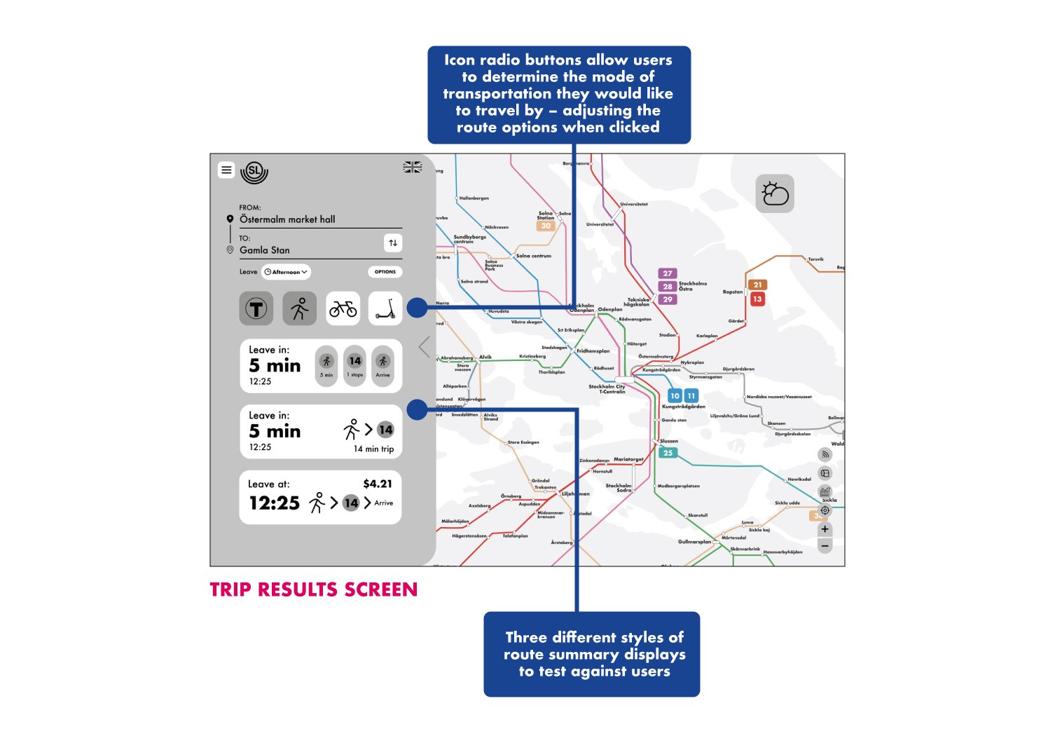
Research goals for the first round of testing on the desktop wires:
Determine which route display option users prefer
Determine if the toggles present are necessary, or if more/less are required
Learn if the current style of heat map is the best way to show traffic on the various metro lines within the Tunnelbana transit system


TESTING THE MID-FIDELITY DESKTOP WIREFRAME
First usability test results
(8 users, moderated):

The mid-fidelity wireframes were tested (moderated on Zoom) asking users to complete a series of task to click experience both user flows:
clicking through and experiencing the various “research” features
planning a trip from point A to point B and sharing the directions to their phone
Initial user feedback:
"I had a hard time finding where to send the route to phone, I imagine it would be at the bottom as a last step"
"Make the add to phone CTA more noticeable by adding color or making it a button"
“I found displaying the walking symbol, number of minutes, and walking symbol again highly effective at communicating route steps"
"The heat map is kind of confusing because it includes areas that I imagine the train tracks aren't located"
"Slightly unclear which was traffic status because button said "trains are ___" instead of check train traffic"
"The wording of the heat map button was unclear"
User feedback was integrated into updated high-fidelity designs, and two color schemes were created, with the UI inspired by the look and feel of Visit Stockholms website.
The colors and typeface are shown above.
A/B testing two high-fidelity color schemes
While designing two potential color schemes became apparent, stemming from the identified brand colors. Rather than making an executive decision, an A/B test was integrated into the second round of testing to see which look & feel users preferred.


So what changed?

UPDATING THE HIGH-FIDELITY DESKTOP PROTOTYPE
A sample of the high-fidelity wireframes can be seen above.
Research goals for the second round of testing on the high-fidelity desktop wires:
A/B test two color schemes for the high fidelity solution
Confirm if the updated toggles meet users needs
Determine if changes made – the heat map button, narrowing a route summary visual style & moving icons within turn-by-turn result in fewer user errors


TESTING THE DESKTOP PROTOTYPE
Second usability test results
(20 users, unmoderated):

The high-fidelity prototype was tested (unmoderated on Maze.co) via a series of tasks and post task questionnaires across both user flows, to further define included features, UI and the trip planning flow.
Maze results can be seen below.
Additional user feedback:
"Traffic display looks more like a weather map instead of traffic flow."
"A legend on the traffic map would be helpful. I was expecting specific streets, intersections, etc. lit up."
“I always put my destination first when route planning – because this never changes. My starting point can change.”

From a heat map reminiscent of a weather doppler, to more line specific focused touch points.
Before and after designs can be seen below.
What do users think of the update?
"It is an improvement over the initial design – I can tell the colors relate to specific train lines."
"I would like to see how surface street traffic relates to train traffic – I first thought line colors were traffic statuses."
“I prefer the new, updated version – and am wondering if there is a way to highlight a line if its busy, without it being a colored shape.”
UPDATING THE TRAFFIC HEATMAP DISPLAY
It was then time to test!

In order to successfully translate the desktop features and interactions to a mobile web version a second round of sketching took place.
Due to varying mobile screen sizes features were grouped into like categories and strategically placed within the map and screen, with setting related features (e.g. user location and fare currency preference) placed under a hamburger menu, and map related features (e.g. information overlays and train line statuses) integrated within the map via a series of toggles and expanding modals.

BUILDING THE MOBILE EXPERIENCE
The mobile experience needed to have the same look and feel of the desktop experience, for brand continuity and user adoption, but also had the underlying goal that it would be simpler on screen as most users would use this version, particularly on the go. One of the easiest ways to gain this information and determine if the mobile translation was successful was by running moderated tests on Zoom.
A sample of the high-fidelity wireframes can be seen below.

Research goals for mobile prototype test:
Determine if the turn-by-turn experience on desktop translated successfully to the mobile experience
Based on industry standard, are there features users wish were integrated (and/or removed) within the mobile experience?
Determine what additional accessibility features need to be added to improve the mobile experience (for both new & seasoned riders)
Displaying features by type
Route planning on mobile


TESTING THE HIGH-FIDELITY MOBILE EXPERIENCE
Mobile usability test results
(5 users, moderated):

The high-fidelity mobile prototype was tested (moderated on Zoom) with 5 users – some had previously completed the desktop testing, others had not. Similar to the desktop tests a series of tasks were presented for the users to complete across the defined research/exploratory and trip planning flows. Following each task a handful of questions were asked based on the user's immediate experience, and a post-test questionnaire was also asked following the completion of all three tasks.
Research where various services are located throughout the city of Stockholm by clicking around the prototype
View the all statuses for a specified train line, and show where to find more information
Plan a trip from point A to point B and share the directions
Moderated testing results can be seen below.
For now…


THE FINAL PRODUCT
Reflections
Heavy hitters in the mobility industry – such as Waze, Google Maps and Apple Maps – have established patterns and features that users have seamlessly integrated into their lives. In order to design a successful and innovative product, you do not need to try to reinvent the wheel
Don’t underestimate the power of A/B testing when it comes to making final UI decisions
No matter how small the task may seem, testing is key! 5-10 users is all you need to establish a pattern when it comes to user behavior, pain points, needs and goals, that will improve your product
Next Steps
Final usability testing on the mobile version of the site lead to many interesting takeaway for phase 3 edits that can further improve the experience. Many users expressed interest in wanting additional information surrounding:
surface street display
police & embassy information
real time delay displays, and
current train location with estimated (station specific) arrival times
I know personally that although the traffic heat map display (on both desktop and mobile) was an improvement from the first iteration, there is still a better way to display this information – and users agreed. This is the biggest hurdle to tackle moving forward, as displaying this type of traffic information on a metro map has not really been done. In addition, diving into making the turn-by-turn experience even better on mobile would lead to more user adoption.