
OneSpring Careers Page
Bringing transparency, inclusivity and empathy back to the job search, with an accessible, well-tailored and user-friendly application process.
To jump to a specific section of the case study choose one of the items below, otherwise keep on reading!

Overview and Context
Project Details
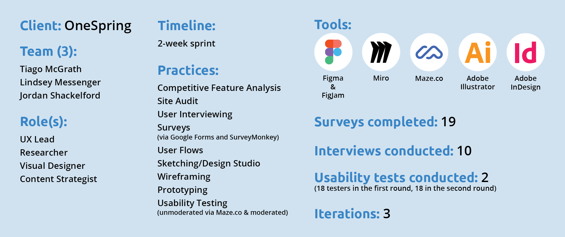
This was a 2-week sprint project for the client OneSpring. My role(s) were UX Lead, Researcher, Visual Designer and Content Strategist. The practices I employed were Competitive Feature Analysis, Site Audit, User Interviewing, Surveys , User Flows, Sketching, Design Studio, Wireframing, Prototyping and Usability Testing (moderated and unmoderated on Maze.co). The tools I used included Figma, FigJam, Miro, Maze.co, Adobe Illustrator and Adobe InDesign.
For this project, I worked with a team to redesign the job application process for Atlanta, Georgia based design consultancy OneSpring.
The brief:
OneSpring is a design consultancy focused on designing better products and software for their clients. They truly believe software has the ability to directly impact our world and daily lives in meaningful ways; and are committed to making a positive impact on the world by helping individuals, corporations and government agencies create the most elevated software experiences in highly-effective and efficient ways.
The problem:
How can OneSpring attract a diverse background of highly-specialized and gifted consultants with experience across many industries and disciplines when their “Careers” page is weak and falls short of the competition?
This is where my team came in.
The response:
We were tasked with redesigning OneSpring’s a Careers page so it caters to attracting UX and design experts. Based on the needs of both the business and the customer (e.g. job seekers looking for a new opportunity in UX Design), we redesigned OneSpring’s existing careers page that provided potential applicants more transparency into OneSpring’s internal company culture, their community involvement, benefits available to employees and hiring process.
My role:
Pulling from my previous experience in the agency world, I guided the team as the UX Lead and also worked as a UX Researcher, Visual Designer & Content Strategist, sharing all aspects of the work with my teammates.
The solution:
If you want to play around with the final prototype, please click here:
If you want to read all about my process, please scroll down and utilize the table of contents!
The Process
Even though OneSpring is known locally as a top UX design firm that is active within the community, there are still many potential future (OneSpring) designers that are unaware of the consultancy’s presence in the Atlanta area.

Current Offerings
The current Careers page on OneSpring’s site consists of an “Open Positions” scrolling navigation content block and individual job postings (sorted by department) that include a couple line description and an “Apply Today” button, linking to the modal Typeform application pop-up.
Competitive Feature Analysis
We began our research for OneSpring’s career page by checking out how other local agencies and consultancies are presenting their company and career offerings. We did our due diligence searching on Google and browsing top Atlanta agency lists on sites such as Built In, The Manifest and Clutch, narrowing down the competition (based on relative size, location and clients) to 6 top competitors. Once we had our list of competitors we compared their features, company offerings, job posting pages, and shortcomings to investigate where OneSpring fit in.
We found that across 9 features on careers pages and 10 features on job posting pages OneSpring was falling short of its competition.
On the careers page...
All of the competition featured a section on their company values
4 of the companies included a content section relating to the benefits employees receive
And half of the companies included information relating to where they were located and why that could be seen as a benefit

On the job posting page (not included on OneSpring.net)…
All of the competitive companies included a required skills section and gave a detailed position overview
5 of the 6 competitive companies included a blurb about the company and detailed responsibilities of the role
And half of the companies featured required education and experience for the role

Surveys and Interviews
To gain critical insight into what OneSpring’s users are currently experiencing during their job search, their likes and frustrations with job applications and what their ideal job searching experience looked like, we sent out an initial Google Form to various UX channels on Slack, posting in UX groups on Linkedin and sending directly to users that we knew are (or are about to be) on the job hunt for a new UX Designer position. This first round survey resulted in 10 responses.
That survey said…

We then identified 10 users from the survey responses who were willing to chat more about their experiences, giving us more insight into the emotions they experience while job searching and applying, the process they go through when finding and applying to jobs, and what frustrations they face through every stage in the process.
As we began to synthesize all of these key findings and trends (from both the first round survey and the interviews) into an affinity map we realized that we were lacking important quantitative data including the amount of time they invest into the entire process, the amount of time they would ideally like to spend, how much of a job posting they are actually reading and how many users understand what is required of them from a job title alone.
So we put our heads together and created a new, more targeted survey on SurveyMonkey and sent it back out to our personal networks and the wider UX network.

This second round survey resulted in 9 responses with the quantitative data we were searching for to really improve the experience across OneSpring’s website.
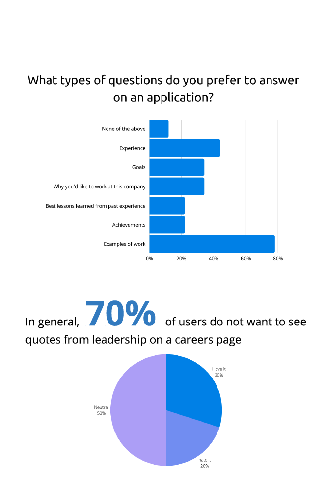
Users do not know what is expected of them from job title alone
A little over half of users actually ready a job posting, in its entirety
And 3/4 of users want to see more transparency from a company on their careers page


Persona(s)
The new insights we gained from our second round survey, coupled with our first round responses and the findings from our user interviews informed our development of one main persona, and the ability to identify the characteristics of a potential second persona. These personas helped inform our design decisions for the rest of the project.
The primary persona: Lyric Bordeaux
Lyric currently works full-time as a Senior UX Designer in the Atlanta area – with experience in both the government and consumer brand sectors. She values companies that provide transparency regarding their internal culture, diversity & inclusion and benefits on their careers page, and offer remote options. Because Lyric has a FT job she wants a quick application process that allows her to continue to network and search for jobs in her spare time, all the information she needs regarding an open UX position so that she doesn’t have to try to guess what she is getting herself into, and empathy from a company to include her in the application and feedback process along the way.

Lyric needs...
a welcoming and candid careers page with well-tailored offerings, so that she can have a quick, accessible and less daunting job searching experience.
Our secondary persona would be someone who takes longer to complete the application process. They value having the time to really research a company before applying, tailoring their resume and cover letter to the specific position they are interested in and going the extra mile to network and reach out to the hiring manager after applying.

"How Might We..." Statements
To solve Lyric’s current job searching pain points, needs, wants and goals we thought to ourselves…

User Flows
Our survey and interview responses, the key trends pulled from our affinity map and our how might we statements were the building blocks of the 3 main paths we identified Lyric could take to find and apply for a job at OneSpring.
These series of user flows were built to define Lyric’s journey and process, two fundamental tasks for our redesign.

The first path that Lyric could take would be the path she is ideally looking for: Through the main/global navigation at the top of the page.
From there she would click on the “Careers” page link.
She would then browse through the Careers page offerings and scroll to the job postings.
She would then click on the “UX Designer” position opening to learn more.
After reading through the job page she would then click to “Apply”.
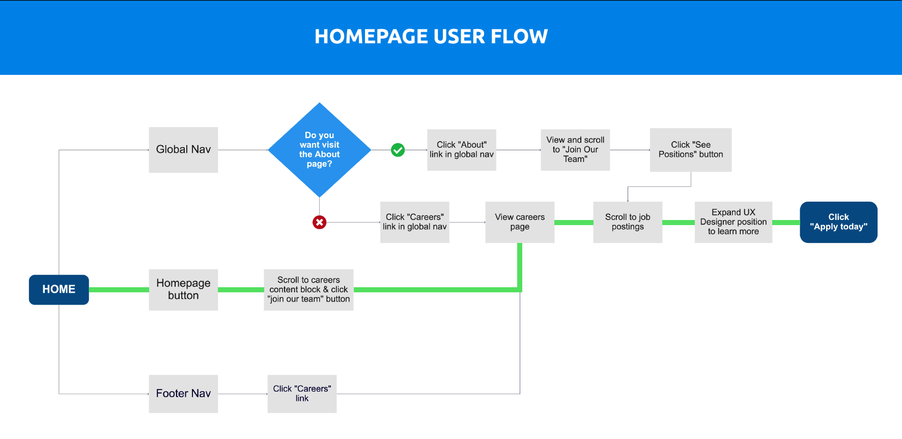
The second path Lyric could take would be through the homepage directly. A path she is not use to, but that she would encounter while browsing.
She would click the link “Join our team” to navigate to the Careers page.
After seeing a “See positions” button at the top of the page she clicks and is automatically scrolled down on the page to the “Open Positions” table of offerings.
She would then click on the “UX Designer” position opening to learn more and apply.

The third path Lyric could take would be a path she currently most used to: Through the footer navigation at the bottom of the page.
From there she would click on the “Careers” page link.
She would then either browse through the Careers page offerings and scroll to the job postings, or immediately be taken to the open positions table of offerings by clicking the “See positions” button at the top of the page.
She would then click on the “UX Designer” position opening to learn more.
After reading through the job page she would then click to “Apply”.
1-Hour Design Studio
After mapping Lyric’s potential paths we took what we learned from our research, put our minds together and ideated as many solutions as we could (as quickly as we could) through a design studio sketching session, coming up with the following possible solutions for the flow starting from OneSpring’s homepage.
An A/B test approach as to how the open positions content block could be laid out (in a table versus individual text/button blocks in a grid format)
A content block approach using mostly squares for any images present
A content block approach that would integrate all of the content block styles we saw throughout OneSpring’s website for the various sections on the careers page
We decided that at the end of the day to go with a more streamlined content block approach would be best, including sections for culture, diversity & inclusion, benefits, open positions and hiring process would best meet the needs defined by our users in our surveys and interviews. We also decided that a table approach would be the best way to minimize confusion for users when it comes to seeing what is available that they could apply for.
Round 1 Sketches

Refined Sketches (Round 2)

Final Sketched Design (Round 3)
The changes above after completing the second round of sketching in our design studio further defined our design decisions, and resulted in the following solution to start testing.


First Round Testing of Mid-Fidelity Wireframes
The only way we would know if our resulting sketches were headed in the right direction was to test them with our key users.
We built a series of mid-fidelity wireframes (created and prototyped using Figma) based on the needs of our main persona (and potential secondary persona) and the sketches produced by the group in our Design Studio. A sample of the mid-fidelity wireframes, which are in black and white with image placeholders and representative text are shown below.


These wireframes were then put into Maze with two accompanying “missions” (aka tasks) to apply for both a UX Designer opening and Business Analyst opening, allowing for us to A/B test two variations of the application Typeform OneSpring currently uses: an embedded version underneath the job posting, and the current modal pop-up version OneSpring utilities. Following the tasks, subsequent reflection questions were asked to help us acertain the following goals:
Determining if putting the link to the careers page in the primary navigation is the best location
Learn what content is the most important for users on a careers page
And, determine whether users prefer a modal Typeform process or the embedded experience
Once the Maze usability test was finalized it was then shared globally across our social networks and within the wider UX community on Slack.
These first round usability tests were completed with 18 users, resulting in mixed outcomes. While users praised the overarching design and content blocks, they struggled to complete each of the tasks (partially due to errors with the Figma prototype loading into Maze), receiving a total score of 30** for the test as a whole.
And the people said…
There were 5 main issues with the wireframes:
“I was confused was the responsiveness of the job positions table — it looked like just a table, no signifier to indicate clicking into the role is possible.”
“A little frustrating — I clicked on the wrong position initially (the table was a little hard to read, my eyes went straight to the location since it was right down the middle) and went through the application flow. The primary 'Apply Now' CTA was a little hard to find. There was a lot going on on the page."
“I wanted the job postings to be listed closer to the top. I had to do a lot of scrolling to find them.”
“I personally prefer the embedded form, as a popup can bit a little more jarring to me.”
“I would recommend a more intuitive approach. Applying for jobs is never as exciting as the flow was.”
**Maze calculates the usability score for every screen in the expected paths. The score reflects how easy it is for a user to perform a given task (mission).
Design Iteration
It was time to fix as many errors as possible within our available time frame, resulting in 4 alterations to the prototype.
So what changed?
-
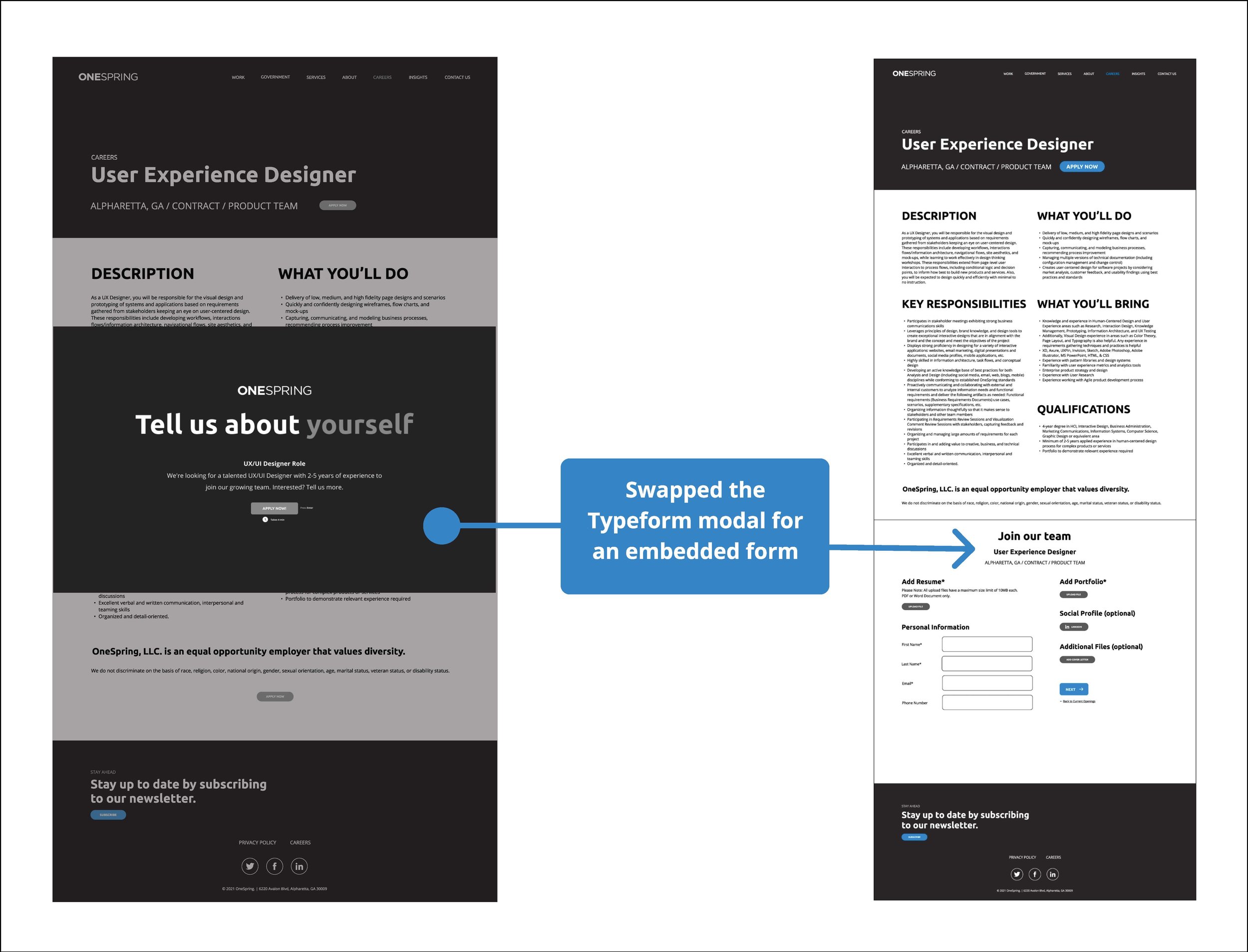
We removed the one-liner introducing OneSpring to reduce clutter and repetition (from the About page), and increase proximity for the content block.

-
We listened to the user feedback and swapped the underperforming model Typeform application for an embedded form field to run a second A/B test.
-
To increase the success rate of the tasks (missions) in the second round of usability testing, we increased the size of the CTA buttons throughout the Careers and Job Posting pages.

-
Following our second usability test we adjusted the title of the embedded form fields content block to decrease confusion among users.

Second Round Usability Testing on High-Fidelity Prototype
Due to the fact some of the results of our first round of usability testing were affected by the mid-fidelity nature of the prototype, we brought this second iteration up to high-fidelity (which included additional UX Writing and UI components), with additional prototyping that would support all actions on both the careers page and job posting page to account for additional paths users may take outside of the defined paths within the user flows.


Additionally, because of the fact our first round of testing did not provide the information we needed to determine the exact content our user wanted to see on the main careers page we created three “missions” for our second usability test, the first being to have users browse the careers page in its entirety before applying to a job.
This second round of usability tests allowed us to see the viability of the user-influenced modifications we made, as well as run a second A/B test on two different styles of embedded application forms. By integrating these additions the second round of tests — which include 3 separate tasks to both browse the careers page and apply via two different embedded forms — concluding with an almost 86% success rate.
This time around the people said…
This second round of usability tests was completed with 18 users, resulting in far more positive outcomes.
69% of users were able to complete the second task (applying for a UX Designer position within embedded form fields), and 54% of users found the second task easy
Of the 18 total testers, 13 went on to complete the third task. 92.3% of these users were able to complete the entire flow, and about 75% of them were able to complete the task with ease
In general users had a much easier time completing the tasks (missions) within the second usability test — doubling the usability score to 61 — with a majority of the feedback being positive, focusing on overarching suggestions relating to UI improvements:
“It would be nice if there was an "apply" or "apply now" button in each row of the jobs table. I wasn't sure where I was supposed to click — as there were no indications of hyperlinks (color, underlining, buttons, etc.).”
“I liked seeing the hiring process flow chart. I really appreciate the transparency for the sake of setting my expectations when I apply."
“I want to see salary. Be transparent about what roles pay.”
“"The positions should be the focus, the other content secondary.”
“It would be good if the forms could be auto-filled based on resume.”

Final Product
A sample of actions are shown below.
If you would like to see the final prototype, click here:
Our client project concluded with our team handing off all of the files from research to final prototype to our client, so OneSpring is able to develop and bring the finalized designs to life on their site.
Reflections and Next Steps
My first step into the world of UX/UI Design for a client was a success that I am proud of. Working with both my design team and the team at OneSpring was not only a valuable learning experience but also a great mentorship, from OneSpring CEO Jason Moccia, into the nuances of how to present design decisions, backed by data and key findings, to a client.
I enjoyed being able to really hone into the roles of UX Lead and Visual Designer – a key takeaway I took from my first group project designing a product for Lonely Planet.
Defining roles up front is key to a group project’s success
It’s key when presenting to clients and stakeholders that any and all design decisions can be backed with quantitative data, particularly percentages
Reflections:
Designing for a user base that you as a designer also fit into is one of the hardest situations a designer will face when it comes to ignoring and pushing down your own personal bias and assumptions – but when you can successfully do that your design truly triumphs
A/B testing is a great way to interpret feedback from users and further design the best solution for all personas
When in the research phase it’s key to structure surveys in a way that they will pull quantitative data, and using interviews to back up that data with additional qualitative data
If we had had more time on this project we would have...
Next steps:
Taken into account many users expressed interest in companies being more transparent regarding the salaries on available job postings – I would have liked to dive into this aspect further with additional user research as to what part of the process (if any) they would like to see this information
Users also expressed interest in learning about what companies are doing to promote inclusivity and diversity – this would be a further conversation to have to with OneSpring in regards to UX content on the careers page, following additional surveys and/or interviews